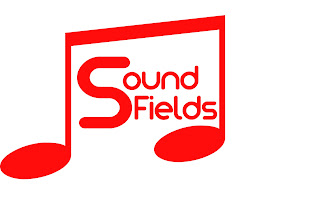
After feedback on my masthead/title combination, ("bland", "Needs jazzing up", "Too straight") I have decided to experiment with some new ideas and have come up with the above which I like alot!! I need to work out how to enclose the masthead, colour schemes etc.
This has made rethink the whole layout of my cover, including my main image. The more magazines I have looked at, the inspiration and ideas i have got. I have asked a fellow student who is a talented photographer to take some new shots. As my double page spread article is going to be called "The two faces of Will Jones", I thought it would be good to present myself as a confident outgoing performer who is revealed in the interview to be very shy.
The advantage of a pose like this is that the text can be easily positioned around the raised arm and still look striking. I have got a few sample images so I have an idea of what to use for the real thing.


No comments:
Post a Comment